In this third article of the AGL BI Journey series we focus on code activity, why is it relevant to focus on it early and additional advice for practitioners relevance and
In the first article of this series, I introduced the Business Intelligence journey we started with Automotive Grade Linux (AGL) and explained the goals of the study. In the second article, we analysed the structure of the AGL community. We looked at who contributes, how organizations participate, and how the ecosystem is shaped. Now we move to the next step: code activity.
This article is based on the study performed by Toscalix and Bitergia for Automotive Grade Linux (AGL), a project hosted by the Linux Foundation. The full study and the Report are available in the AGL wiki.
What Do We Mean by “Activity”?
After characterising the community, the next logical question was: How does AGL produce the AGL Platform?
To answer that, we analysed what we called (code)activity. In practice, this means:
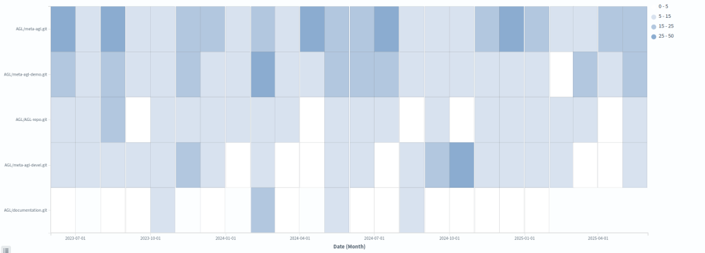
- Code activity in repositories
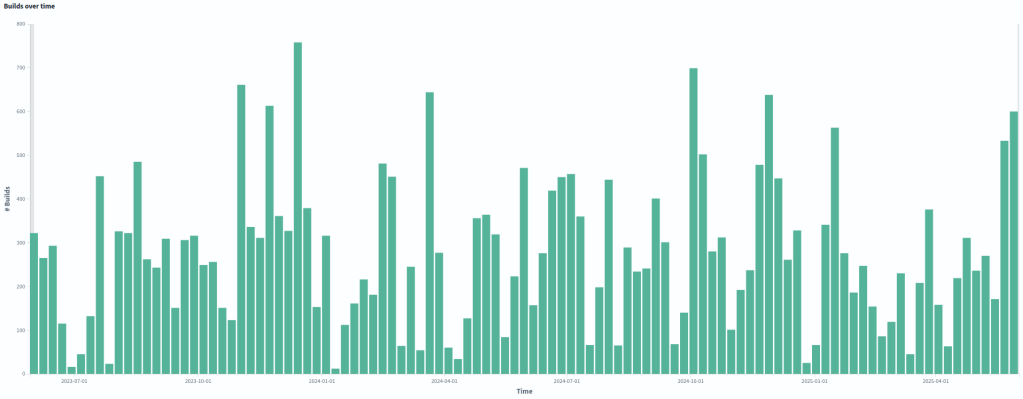
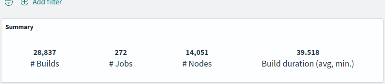
- Build activity in CI systems
In addition to the above, we have considered:
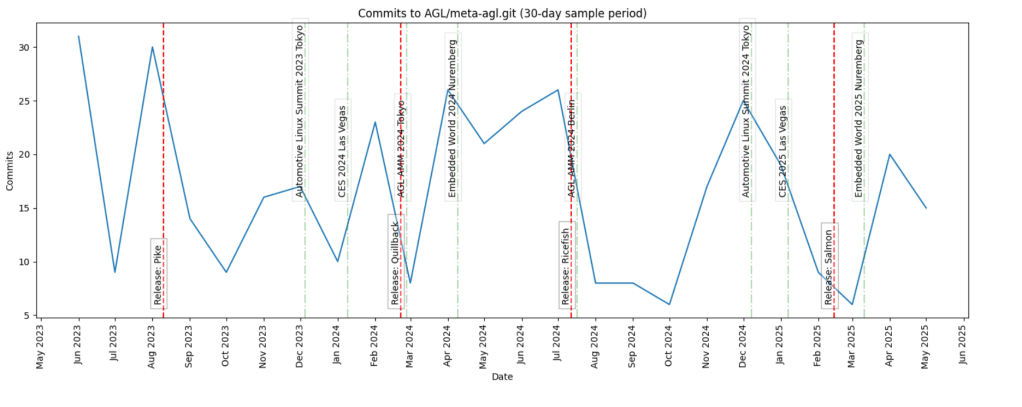
- Organizational milestones: workshops, events, vacations,etc.
- Product milestones: mainly UCB releases
Out of the five main lifecycle stages:
- Design/requirements
- Development
- Delivery
- Release
- Maintenance
We focused on the development and delivery stages. Understanding the activity around code is essential to understand flow. Without measuring activity, you cannot observe how value moves across the production system.
Branches vs main/master
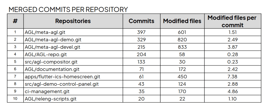
In open source, a significant part of the activity takes place in branches, which in embedded environments is even more common, specially when local testing on hardware is required. However, we focused only on main (master). You might think that we would not get an accurate picture of code activity by ignoring branches. That’s only partially true because main/master represents validated and integrated work. It is the closest representation of delivered value.
In commercial environments, we usually analyse branches as well. Doing so can reveal:
- Excessive work outside main
- Lack of trust in pipelines
- Weak automated testing
- Organizational friction
- Limited experience with techniques such as feature flagging
In open source environments, branches are even more common, as mentioned. Platforms such as GitHub and GitLab have reinforced this practice with their popular Git Flow variants.
For this first iteration of the study, however, we kept the focus simple: code activity in main/master.
From Raw Data to Dashboards
As explained in the first two articles [1][2], the study was published in the AGL wiki. We avoided overloading readers with too many graphs. At this stage of the journey, simplicity is a feature. By clicking the graphs and tables on the wiki, you can zoom in. We have included a few .pdfs for download, including the tables available in the wiki, for convenience.
The simpler the visualization, the easier it is to:
- Interpret
- Communicate
- Use in decision-making
All graphs were generated from dashboards built using the Bitergia Analytics Platform, based on GrimoireLab. Some metrics come by default on the platform. Others were created specifically for this study. You can get a good overview of these kinds of dashboards created with BAP, which is based on GrimoireLab, applied to Eclipse Foundation projects. As you can see there, the tool can integrate many different types of data sources. It can also provide a wide variety of visualizations.
Each graph might be part of different discussions and insights, which is why we separate the graphs from the analysis into different wiki pages. It is important to build dashboards with live data. But it is equally important to freeze some visualizations for analysis and reporting. Analysis lives in dedicated wiki pages. This separation improves clarity.
As you can see in the Activity sector of the study, the visualizations we have used are fairly simple. Simplicity is a feature. The goal is not to impress people with complex dashboards. The goal is to make data part of daily conversations.
Practical Lessons for Practitioners
I would like to close this article with three practical reflections based on my experience and on the work we did together with Bitergia.
1.- Do Not Start with the Ticketing System
Many organizations I have been involved with put their initial focus on the ticketing system as primary data source. I believe that is a mistake.
Work packages provide an overview of what happens across the production system. A ticketing system represents work. It is a model of reality. It is not reality. The code is the closest representation of reality in a software production system.
As software products become more complex, the gap between tickets and code grows:
- More developers involved
- More and stronger dependencies
- A longer and more complex software supply chain
- Lifecycles with more stages, making it harder to get an end-to-end view
- More hardware-software integration
In complex software systems, tickets can become a “second life” that does not fully match the real world — the code. Identifying and characterising that gap is one of the first outcomes of measuring activity around the code.
Tickets are important. Bugs and requirements matter. They should be included in the study, obviously. But if I must choose between starting with tickets or starting with code, I choose code, despite the higher complexity related to the ETL process and the analysis.
AGL’s ticketing system should be included as a data source in future iterations of the study. Bugs and requirements are necessary to obtain an end-to-end view of the production system.
2.- Do Not Drown in Metrics
One of the risks of measuring code activity is the high number of variables you can focus your attention on. Spreading your attention too thin among too many metrics is a common mistake.
Success is rarely achieved by providing as many metrics and visualizations as possible to as many people as possible. Very soon, people who need the big picture can feel drowned in data, and it becomes harder to make any of the outputs truly actionable.
Fewer metrics used by more people brings more value than many metrics used by a few.
In practice, this means starting by being useful for a small group, with a limited number of roles and needs, and growing from there. If you can choose those first internal customers, select the hardest ones to convince.
Choosing that first subset of metrics is always a challenge and usually requires a discovery process. In the study, we looked at the needs and struggles of the target people or team, the knowledge we had gained about the production system up to that point, and selected one or two metrics for each relevant data type that together provided a simple “walking skeleton” end-to-end view.
In the AGL study, we documented an early version of this metrics matrix in the wiki so practitioners can see the process we followed.
If a metric is not widely used, try to replace it, at least for a while. Unused metrics are noise, and the same applies to graphs.
Less is more.
3.- Focus on the data hub at first
No matter how rich your visualisation capabilities are, or how powerful your chosen visualisation tool may be, they will not cover all use cases. The farther you move along the BI journey, the more use cases will fall outside your existing dashboards.
This is another critical reason to focus early on the data hub and to make processed data easy to consume through different tools, including your own visualisation tools.
In many organisations, data teams operate as internal platform teams. A common mistake is to spend most of their time building custom visualisations on demand, instead of first making the data easy to access.
By focusing on a data hub early enough, you open the door for other groups within the organisation or projects to use the available data for many different purposes. They can take advantage of the work that the “observability” or “data/BI” team has already done, which becomes extremely valuable over time.
In the AGL study, Bitergia invested in building a data hub that third parties can consume and transform, following an open source and open data approach that goes beyond the tools themselves.
There are many options in the market that lock your data in, so that only the supplier can open the gate for other tools to consume it, usually after paying considerable fees. These costs are often ignored during tool selection and procurement.
As usual, if you can, go for open source.
Summary
In this third article of the series, we moved from community analysis to code activity analysis. We analysed code and build activity, considering contextual information such as organizational and product events.
We restricted our analysis to main/master to observe validated flow, kept visualizations simple to promote adoption, and prioritised building a solid data hub.
Measuring activity is not about producing more metrics. It is about supporting better decisions and enabling continuous improvement.
In the first article, we introduced the goals and structure of the AGL BI study and explained why AGL is a useful case for delivery performance analytics. The second article looked at the AGL community and why community context is necessary to interpret activity and process metrics.
The full study combines community, activity, code review, and delivery process analysis, and ends with conclusions and recommendations for the AGL project and for practitioners working on software-defined products.
Future articles in this series will cover the code review and delivery process findings in more detail, following the structure of the study and its final report.
Read the full report at the AGL wiki:
- Introduction
- Measurements and plots: activity
- Analysis: activity
- Report:
Read the previous articles of this series:
- The first article of the series, an introductory one.
- Check the second article of the series, providing insides about the characterization of AGL’s community
Graphs extracted from the study, published on the AGL wiki. Text polished using IA

2 thoughts on “AGL’s Business Intelligence Journey – Understanding Activity”